Astros uniforms, the past, present and future
/The Astros are making lots of changes. They went from being a perennial competitor for the NL Pennant to the absolute biggest joke in all of MLB, except for the Royals and Pirates who have sucked for so long that most people think they actually are farm clubs. As the Astros move to the AL, new owner Jim Crane has opened up the possible name change can of worms. I think it’s also pretty much a given that there will be a uniform change.
The Astros have changed their uniforms and color schemes many times over the years, far more than the average franchise. Here are most of the major uniforms and logos… Astros uniform history link
Let's comment on each one. This excludes the original Colt .45's uniform, which is awesome, and greatly influenced the first Astros uni. They will be wearing the old Colt .45 uni's this year, but with a minor, lame adjustment, read more about that here.
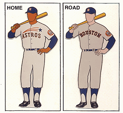
The first Astros logo and uniform. These are awesome. Simple, fun, original color schemes that link these Astros to the Colt .45's. Orange and Navy Blue. These are the franchises original colors and they look great together. This scheme is easily recognizable as "Astros". Totally original and unique.


Next up is the the last minor change in uniforms the Astros would ever make. After this the changes would become major. This is the uniform they wore from 1971-1975. It keeps the basic design from the first Astro uniform, but inverts the colors, making orange more prominent. While it's a change, it keeps the same "feel", and is a good transition. This uniform sets the stage for the boldest uniform change in sports history (not hyperbole).

In 1975 the Astros got very creative and very fun, this was the result....

And the accompanying logo....

These uniforms are insane. Insanely great, or insanely terrible, depending on who you are. Regardless of what your personal opinion, these are the most unique uniforms in sports. Literally every person in Houston that I know would like to own one of these uniforms. Thanks to the internet you can. They are so memorable that they transcend sports. People who don't follow baseball could see this unifrom from a distance and know instantly that its an old Astros uniform. It's very difficult to manufacture that kind of brand awareness. Yet, for the past 15 years the Astros have barely acknowledged this era. They almost never wear these uni's (even on "throwback days"). While other franchises have trotted out their "old school" uniforms with great regularity, the Astros rarely officially recognize that these even exist. However, there is a huge following for this classic look.
In the 80's the 'Stros kept the Rainbow uniforms, but added some other uniforms that incorporated the orange rainbow....

These uniforms add a nice complement to the rainbow jersey. They still incorporate the rainbow, orange and navy blue... the three things that are the "style" of the Houston Astros. The 1986 team that won the Western Division title wore these. If you can ignore that they are basically softball uniforms (no belt, no buttons, pull-over tops) which was the style at the time, then they are awesome. Also, they had 4 different uniforms. I like the variety. More options to buy, more options to sell. You listening to that Jim Crane?
Next we get to the big departure. The radical change. The Astros ownerships changes, and here come the new uniforms that go in a totally different direction...

This begins the Drayton McLane era that severes the attachment to Astros history, and in my opinion makes the Astros just another MLB team (in terms of brand marketing, recongizablity, and coolness). When this was introduced I remember people being favorable towards it because it was a departure from the old stuff. The Astros sucked pretty bad at this time too, so this felt like a fresh start. But these uniforms lasted only 6 seasons, and frankly are so completely average in every way. They are embarrasing compared to the stuff they wore for their previous 30 year history. When Drayton got his new ballpark (Enron, errr, Minute Maid) they changed the uniforms yet again, and once again jettisoned all connection to any historical Astro uniform, logo, or theme.


Now the Astros colors are Rust and black? Seriously? These have been the uniforms for 12 seasons now, and they are utterly and totally forgettable. The color is boring, the uniforms are boring. Yes, the Astros have been very good (and very bad) during this era, but no one is imitating these uniforms. No one in other cities is saying, "Wow, the Astros uniforms are cool." This color scheme is lame, and they should punt it for the move to the American Leauge. The good thing about the current unis is that there are numerous uniforms that do get mixed and matched, I like that.
Here’s my observation. The Drayton McLane era of Astros baseball was very successful (hooray for that, seriously) but it was also very predictable, unimaginitive, averse to risk, and lacked any creativity, especially as it pertains to uniforms and marketing.
Here are my suggestions for Jim Crane and his team...
1. Keep the name. Astros is a totally unique name, there is no other team with a name that is both nonsensical and makes perfect sense at the same time. It is totally original, and not copyable. Keep it. Milk it. Houston totally identifies with it, and since the Oilers left, we have become far too generic with our sports names and logos.
2. Bring back orange. The orange that the Colt 45’s and the Astros wore was what helped make them unique. The old forgotten Astros theme song was all about the “orange fire” ... give it a listen at the bottom of this post. Get behind the color, celebrate it because it's different. Yes, orange can be ugly. It's also completely loud and outrageous, but that has proved to be a good thing when marketing to young people. Take advantage of the strangeness. Here is the logo they are using for the 50th season. I like this way more than anything the ‘Stros have worn in the past 15 years. Because it celebrates the actual creative things the Astros used to be all about. Heck, make that the permanent logo, replace the 50 with a big orange "A" or "H".

3. Become the Oregon Ducks of the MLB. Come up with 8 different uniforms that include all the colors in the 50th Anniversary logo, and wear them all. Interchange them. Go crazy. Orange and Navy Blue should be a major part of each uniform, but get creative, have fun. The team sucks, and will for several years, so make them at least look fun. Sure it's risky. People might mock the new crazy ideas, but at least it will connect with older fans, and possibly win over new fans. More importantly it will help the Astros have an identity again. Especially right now, the team (and the fans) need a new identity, with some connection to past greatness.
If you like cool ideas for uniforms, check these out. Not all of them are good, but most are, and some are really awesome....
Here come the Astros, breathing orange fire!


